Showing posts with label information visualizations. Show all posts
Showing posts with label information visualizations. Show all posts
Tuesday, January 20, 2009
Flight Fluctuations
A simulation of global air traffic, put together by ppl at the Zurich University of Applied Sciences. The map uses data from Flightstats.com, and overlays their position on a Miller cylindrical projection.
Wednesday, October 22, 2008
Shaz Madani - works


Clicked through a notcot post showing Madani's paper art (above) and found myself poking around his portfolio. London College of Communication, St. Martin's College. you know.
Thought this was a cool project, tracking and visualizing a week's expenditures. (black pins are needs, white pins are wants.)


And this is a print promotion for the M25 Motorway in London. "On one side, the poster gives exact directions that would have to be taken to get from one side of London to the other [. ..] The reverse side reads, 'wipe away the confusion take the M25.'"


Tuesday, October 14, 2008
Subway Time

I just bought this at Little Otsu on Valencia. its awesome & combines two of my passions: calendars and subway maps.


Monday, October 13, 2008
Overnewsed but Uninformed

so i don't speak german (as i learned incontestably while in berlin this summer). and thus, i had to rely on google translator to translate the page for me:

"News mediation was the beginning of our century still a few media is limited. ... With the possible anytime access to news about a variety of communication channels has a broad media landscape with a myriad of information producers and suppliers develop. For the viewer, it becomes more difficult to determine authenticity of messages. You are looking for sources to whom they can trust.
Overnewsed but Uniformed helps in the search. Sequences are described, ownership and dependencies disclosed and user behavior illustrated. Background information and the monitoring and analysis of the real message of a bridge no fall in Minneapolis convey the basis on whic the Chamber News better assess and categorize can."
from what I gather, its an infovis of the news-media industry.
can be downloaded (in german) from
www.overnewsed-but-uninformed.de
www.overnewsed-but-uninformed.de
Friday, August 1, 2008
Signs of Life
By Freddie Yauner for his work at Platform 11 at RCA in London.
In his words:
///
We spend our lives being directed by signage, but what do the signs get up to when they have no one to tell what to do? Reactive signage, giving a look into the lives of overworked pictograms.
Site specific instalation for Sleepless exhibition at the Great Eastern Hotel. When people were present, the sign would function, but when the space was empty the overworked pictogram [its very hard work standing on one leg all day] would take a well earned break, that is until he was needed back at work!
Flash animation controlled by a motion sensor.
///
Wednesday, July 9, 2008
extinction timeline
notable extinction predictions:
2009: mending things
2013: getting lost
2018: secrets
addiction outlives intimacy
spam outlives coins
nothing outlives cher
click here to see it bigger
2009: mending things
2013: getting lost
2018: secrets
addiction outlives intimacy
spam outlives coins
nothing outlives cher

click here to see it bigger
Wednesday, April 23, 2008


Saturday, February 23, 2008
tech + graphics
a clock face that uses the pie chart metaphor to tell time

visualizes power through an electric cord

Wednesday, February 20, 2008
Casual Infovis - definition
reflections from a georgia tech student, John Stasko
http://www.cc.gatech.edu/~john.stasko/papers/infovis07-casual.pdf
\\\
"In our view the Ambient Infovis, Social Infovis,
and Artistic Infovis systems, as well as other new domains and uses
of visualization point to a complement to traditional infovis that we
call Casual Information Visualization (Casual Infovis). All of these
sub-domains share the same relationship to more traditional infovis
research, that of center and margin. Though each sub-domain has its
own character, we propose Casual Infovis as an umbrella term that reframes
ambient, social, and artistic infovis, as well other edge cases as
a part of, but different from, more traditional infovis systems and techniques.
We note four differences between traditional infovis systems
and Casual Infovis.
* User Population: The user population is enlarged to include a
wide spectrum of users from experts to novices. Users are not
necessarily expert in analytic thinking, nor are they required to
be experts at reading visualizations.
* Usage Pattern: Usage expands past work, to focus on other parts
of life. Systems are intended for usage that is momentary and
repeatable (over weeks and months), or contemplative (a long
moment at an art gallery).
* Data type: The data is typically personally important and relevant,
as opposed to work-motivated. This means that a user’s
relationship to the data is often a more tightly coupled one.
* Insight: We propose that the kinds of insight that Casual Infovis
may support are different from more traditional systems. We
suggest that developers are interested in providing insight about
data that is not analytical, but instead of a different sort.
Thus, we define: Casual Infovis is the use of computer mediated
tools to depict personally meaningful information in visual ways that
support everyday users in both everyday work and non-work situations."
"Casual Infovis shifts the goals of the systems that are built; system designers
focus on creating insights that are different from the design
goals of traditional infovis systems. If infovis is intended, according
to Card, Mackinlay, and Shneiderman, to amplify cognition and
to provide insight, what does this insight consist of? What may help
to define Casual Infovis systems is to explore the shift in these edge
case’s sense of providing insight."
///
key impact: infovis leads to the paradigm shift of information --> insight
Monday, January 7, 2008
jenga 2.0
mathematicians ask how far outwards you can stack blocks. below, diagrams of the combinatorial architecture of the well-balanced stack.
i'm not sure why i found these images so captivating. maybe it's simply the different shades of gray and all the iterations laid out in a nice grid. really, though, i think i like how a "simple," yet deserving problem gets exploded into a full-on investigation. iterations. force diagrams. some combinations of elements makes this worth posting, i guess.


i'm not sure why i found these images so captivating. maybe it's simply the different shades of gray and all the iterations laid out in a nice grid. really, though, i think i like how a "simple," yet deserving problem gets exploded into a full-on investigation. iterations. force diagrams. some combinations of elements makes this worth posting, i guess.


Monday, December 24, 2007
i miss the subway
nyc subway - 1964

nyc subway - 1972
designed by Massimo Vignelli

ny subway cover - 1972

from design observer:
"In 1968, Unimark International was commissioned to design a sign system for the subways, and out of this chaos came order. Two Unimark designers, Bob Noorda and Massimo Vignelli, developed a signage plan based on a simple principle: deliver the necessary information at the point of decision, never before, never after. [...] Out with the complicated tangle of geographically accurate train routes. No more messy angles. Instead, train lines would run at 45 and 90 angles only. Each line was represented by a color. Each stop represented by a dot. What could be simpler?"
nyc subway - 2005

nyc subway -- 2007

nyc subway - blank template!
this makes me happy. and terrified.

Tuesday, November 27, 2007

IKEA
color-averaged ikea catalog, from infosthetics, who sourced it from jason salovan.


a full-size, 374-page reproduction of the entire 2007 IKEA catalogue, reduced & abstracted to only averaged color & lay-out structure.
"surpassed the bible," is thought-provoking. i was in ikea this past sunday night and felt very zen during my two hour visit. ...was looking around for illuminated object insights and observed myself walking strange, labyrinthine paths around the store... bringing objects from all over the store to hold up against all types of lights... like bizarre offerings to lampshade alters. spent over a hundred on prototyping materials and impulse-purchased idea for a cork board substitute. and if that's not religious zeal, i don't know what is.
i will put up a picture of my cork board curtain later when i'm at home. i'm very happy with it; but will be happier once i get the paperclips that i want.


a full-size, 374-page reproduction of the entire 2007 IKEA catalogue, reduced & abstracted to only averaged color & lay-out structure.
see entire catalog here."with an estimated 175 million copies distributed in 2006, the IKEA catalogue is thought to have surpassed the Bible as the most published printed work in the world. this group of 3 projects (374 Farben, Field Guide to Style, and Color & Catalogue) transforms that ubiquity of design into "varied pure color arrangements"."
"surpassed the bible," is thought-provoking. i was in ikea this past sunday night and felt very zen during my two hour visit. ...was looking around for illuminated object insights and observed myself walking strange, labyrinthine paths around the store... bringing objects from all over the store to hold up against all types of lights... like bizarre offerings to lampshade alters. spent over a hundred on prototyping materials and impulse-purchased idea for a cork board substitute. and if that's not religious zeal, i don't know what is.
i will put up a picture of my cork board curtain later when i'm at home. i'm very happy with it; but will be happier once i get the paperclips that i want.
Thursday, September 6, 2007
rectangular or polar?
an undisciplined booklet of graph paper.


and these:

ingenious. wish i had them in calculus way back when.


and these:

ingenious. wish i had them in calculus way back when.
Thursday, August 9, 2007
the mundane...
...reimagined. i appreciate how these products give mundane information-- time, date-- in an unexpected, special way.
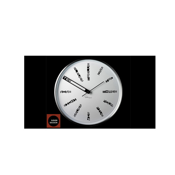
of course, clocks don't even need to denote the hour marks at all, but it's nice to see somethign different. this clock is doing much more than the average wall clock, but the special detail of framing the word probably makes the arrival of the hour more exciting.

(sorry about all the weird white spaces)
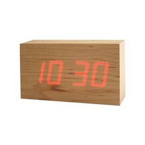
this clock is totally simple and obvious, and yet seems really special. it reminds me of annie (chang)'s illuminated object. i don't know what triggers this, but it always seems special when wood glows.

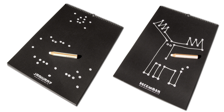
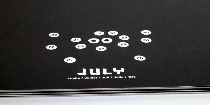
instead of crossing off each day that passes, a calendar that has you connect the dots. each dot has a number inside (the date) and the dots will complete a seasonally-relevant picture at the end of the month...


of course, clocks don't even need to denote the hour marks at all, but it's nice to see somethign different. this clock is doing much more than the average wall clock, but the special detail of framing the word probably makes the arrival of the hour more exciting.
(sorry about all the weird white spaces)
this clock is totally simple and obvious, and yet seems really special. it reminds me of annie (chang)'s illuminated object. i don't know what triggers this, but it always seems special when wood glows.
instead of crossing off each day that passes, a calendar that has you connect the dots. each dot has a number inside (the date) and the dots will complete a seasonally-relevant picture at the end of the month...
Friday, July 20, 2007
attractive magazine covers
covers from what seems to be a science/medicine magazine from the 60's... then published in graphis... then referenced by swissmiss.


Tuesday, March 27, 2007


Subscribe to:
Posts (Atom)