Showing posts with label logos. Show all posts

Friday, October 17, 2008

India + Color

Saw the most recent Sony Bravia video:


This theme of India as a land of color comes up again in the ad campaigns for India's tourism bureau, "Incredible India," (or rather, Incredible !ndia.) here are stills from the flash banner on their site.

incredible india


Andreas and I agreed: it's a cool brand identity for a country. for india, specifically.

Wednesday, April 23, 2008

graphics... type... logos...

Victor Vasarely op art


Victor Vasarely op art


colors and rectangles

colors and rectangles


z475

z475


1975

1975


lost+found

lost+found


colors and circles

colors and circles


depth

depth


diagrams

diagrams


M

M


Y

Y


national year of reading logo

national year of reading logo


book cover for the divine comedy

the divine comedy


soda cans

soda cans


guardian infographic

guardian infographic


Thursday, January 3, 2008

logos

i liked seeing these logos get iterated.

brand union logo

brand union


patterned

brand union patterned


map

brand union map


saks

saks
logo, patterned

saks

saks rebrand by michael bierut at pentagram.

saks

Monday, December 24, 2007

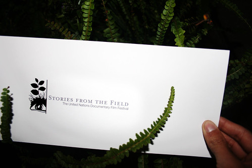
stories from the field

andreas entered a competition to create a logo for the UN film festival. the festival was themed "stories from the field."


here are other entries i thought were nice:


logo2_440x400_


UN_logo_1_440x400_


shards_440x400_


c2_i1_440x400_


Stories_Logo_5a_Chris_Dina_copy_440x400_


Eyewitness_440x400_


christian_champagne1_440x400_


a quickr pickr post

Thursday, July 19, 2007

fwis

kinda obsessed with fwis right now. i've been following their book covers blog for a while now and have only just thought to look into who they are (A: a design group in portland) and what they do (A: a lot more than book covers). their site is pretty great, in that it immediately makes me want to explore-- an excellent use of grayed thumbnails that illuminate with rollovers. plus, sorting options by "we argued," "we didn't get paid," "it just came to me," etc makes the people behind fwis all that much more interesting to me.

here's some stuff:

a logo for a music label, "Friday Mile"


clever. works better than i heart new york, in my opinion.


a book cover they designed. maybe i'm just being sentimental about alabama...


pulp versions of the iliad and moby dick.


i like the blending of science and nature in this book on the history of christianity. overall, it creates this very modern "harmonious" look. the black label-looking thing is a consistent element to all the books in the series and really seems to integrate well into all the different designs.


since when did self-help books look so sexy?


a fun architecture-inspired typeface. would love to have a poster with a giant "Q" on it.


ratatat is playing at work right now. i'm feeling very happy.