Monday, August 27, 2007

something to look forward to

Found thisdayintype.com, which consists of a typographic interpretation of the date, each day. i suppose it's the layman's pentagram font calendar.

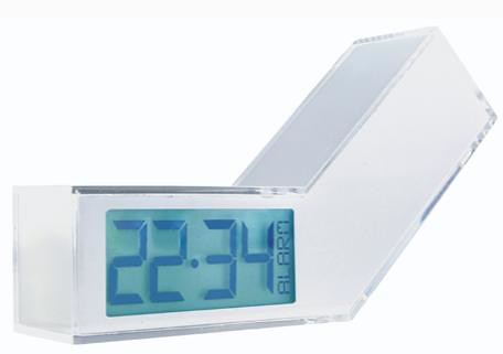
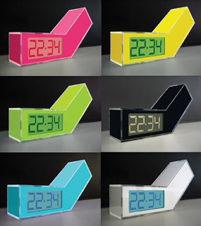
here are some of my favorites.

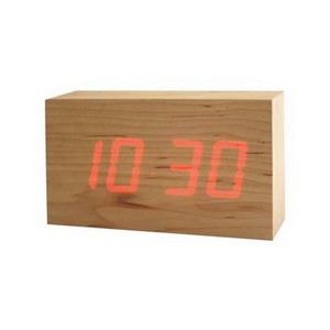
wish this one didn't have the red text, since the form of the numbers is quite lovely.


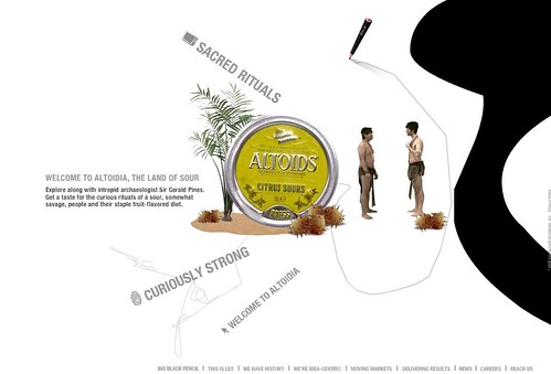
could do without the background image on this one, though i do like the gradient on the 7.


this one is here for mary, since i think she will enjoy an exclamation point with a speech bubble.
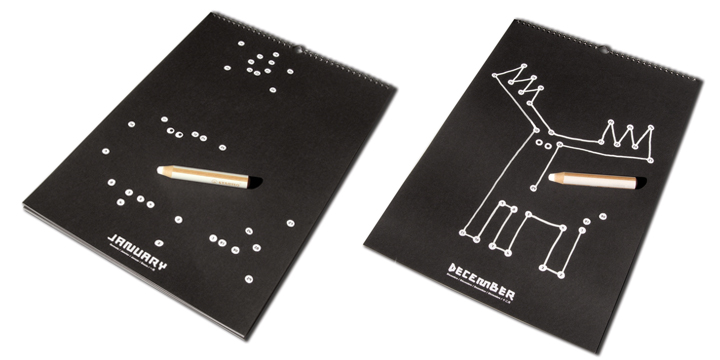


(it's august 3rd)


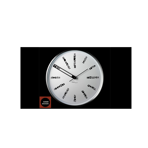
this one isn't too revelatory, but it gets an honorable mention for attention to detail. i appreciate that the A and the 5 meet so well.

Thursday, August 9, 2007

the mundane...

...reimagined. i appreciate how these products give mundane information-- time, date-- in an unexpected, special way.

of course, clocks don't even need to denote the hour marks at all, but it's nice to see somethign different. this clock is doing much more than the average wall clock, but the special detail of framing the word probably makes the arrival of the hour more exciting.


(sorry about all the weird white spaces)

this clock is totally simple and obvious, and yet seems really special. it reminds me of annie (chang)'s illuminated object. i don't know what triggers this, but it always seems special when wood glows.


instead of crossing off each day that passes, a calendar that has you connect the dots. each dot has a number inside (the date) and the dots will complete a seasonally-relevant picture at the end of the month...


balancing acts

i like this switching idea of tipping devices on and off.


collapsible furniture

today is a cool day at work: i am doing research on innovative materials to use in a serving tray. which translates to pouring over design blog archives looking for neat stuff.

this stool is designed by . i love the detail in the center--- the bar/handle to grip it daintily while it collapses.


and here is a dining room in a side table. inside the small, unassuming block is all the parts to assemble a japanese style, low-lying table and seating for six.


and, okay... so this isn't collapsible, but it's wonderfully convertible. a child's chair that converts to a rocking "horse" of sorts.

Thursday, August 2, 2007

print ads

print ads that are very much and very literally print ads. you might have to click to get bigger images.

for lawyers.com


and ad for advertising with national newspapers of ireland. (i think these would be funnier read aloud in an irish accent. but then again what isn't funnier when read in an accent.)


leo burnett

here's a site for an ad agency that really impressed me: http://www.leoburnett.com/


while some might find the dragging pen thing a bit annoying, i didn't get tired/distracted by it. i like the navigation-- things branching off in a web, clicking white space to go "back, hiding the different levels of detail as you "zoom" in and out... and i like how certain "branches" will start playing commercials/media segments as soon as you get "close enough." it almost feels like you're looking in on some microscopic world that was there the whole time. plus its a streamlined way of showing a lot of different types of media in this kind of portfolio.


and after looking through the site, i think it gets a really good grasp of branding itself around an individual, going back to that "paternal creative genius" trope.

what led me to the site, though, was an ad that his company did in Brazil for the classifieds section of a paper.


i seem to be easily impressed by ambient advertising. like these fedex kinko street installations (plus, office supplies!):