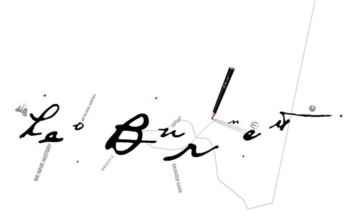
while some might find the dragging pen thing a bit annoying, i didn't get tired/distracted by it. i like the navigation-- things branching off in a web, clicking white space to go "back, hiding the different levels of detail as you "zoom" in and out... and i like how certain "branches" will start playing commercials/media segments as soon as you get "close enough." it almost feels like you're looking in on some microscopic world that was there the whole time. plus its a streamlined way of showing a lot of different types of media in this kind of portfolio.
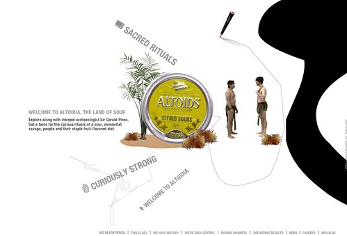
and after looking through the site, i think it gets a really good grasp of branding itself around an individual, going back to that "paternal creative genius" trope.
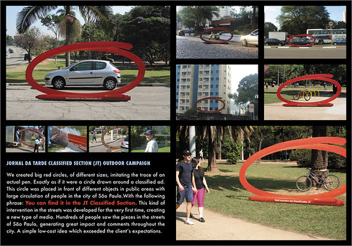
what led me to the site, though, was an ad that his company did in Brazil for the classifieds section of a paper.
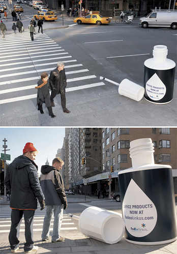
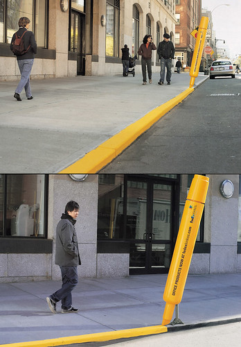
i seem to be easily impressed by ambient advertising. like these fedex kinko street installations (plus, office supplies!):
1 comment:
Those are great. Too bad Kinkos sucks.
Post a Comment