the new architecture in helsinki album just came out. i guess i should go find it. here's a video of "hold it" which is... kooky, to say the least. but i'm pretty excited about what i'm hearing. i anticipate many-an-impromptu-dance party in my room next fall... colleen, consider yourself warned.
they were also on blogotheque with like it or not and heart it races.... Here.
Tuesday, July 31, 2007
Thursday, July 26, 2007
toda on notcot!
notcot.com (notably, not the .org blog) featured TODA today! what a weird experience to see something of ours on a blog i read every day. although a bunch of us in the office laughed at the vaguely positive comment, "I've been a big fan of TODA for years, especially of their furniture/products, because of their conceptual approach to design."


Wednesday, July 25, 2007
science & sons
from scienceandsons.com, the work of two 2005 design grads. they have a really cool logo that would've taken me some time and effort to put up here (so obviously, i didn't).
"Park Planters: The potted plant becomes the backdrop for an urban park scene."
ceramic pots which depict normal and illicit activities that occur in parks (dog walking, picking up hookers, muggings, etc)

Phonofone
a ceramic sculpture that amplifies sounds from earbuds using the physics of passive amplification...


"Park Planters: The potted plant becomes the backdrop for an urban park scene."
ceramic pots which depict normal and illicit activities that occur in parks (dog walking, picking up hookers, muggings, etc)
Phonofone
a ceramic sculpture that amplifies sounds from earbuds using the physics of passive amplification...
Monday, July 23, 2007

Friday, July 20, 2007
attractive magazine covers
covers from what seems to be a science/medicine magazine from the 60's... then published in graphis... then referenced by swissmiss.

colourlovers
so i found this site, on whichpeople create and post color swatch combinations. they title them and then other people rate them, etc etc. it was surprisingly mood-altering to look through some of the postings.
navigation is a little lame and peoples' titles are a bit... erm.... although i appreciate that you can search for palettes by selecting color combinations.


navigation is a little lame and peoples' titles are a bit... erm.... although i appreciate that you can search for palettes by selecting color combinations.
Thursday, July 19, 2007
fwis
kinda obsessed with fwis right now. i've been following their book covers blog for a while now and have only just thought to look into who they are (A: a design group in portland) and what they do (A: a lot more than book covers). their site is pretty great, in that it immediately makes me want to explore-- an excellent use of grayed thumbnails that illuminate with rollovers. plus, sorting options by "we argued," "we didn't get paid," "it just came to me," etc makes the people behind fwis all that much more interesting to me.
here's some stuff:
a logo for a music label, "Friday Mile"

clever. works better than i heart new york, in my opinion.

a book cover they designed. maybe i'm just being sentimental about alabama...

pulp versions of the iliad and moby dick.


i like the blending of science and nature in this book on the history of christianity. overall, it creates this very modern "harmonious" look. the black label-looking thing is a consistent element to all the books in the series and really seems to integrate well into all the different designs.

since when did self-help books look so sexy?

a fun architecture-inspired typeface. would love to have a poster with a giant "Q" on it.

ratatat is playing at work right now. i'm feeling very happy.
here's some stuff:
a logo for a music label, "Friday Mile"
clever. works better than i heart new york, in my opinion.
a book cover they designed. maybe i'm just being sentimental about alabama...
pulp versions of the iliad and moby dick.
i like the blending of science and nature in this book on the history of christianity. overall, it creates this very modern "harmonious" look. the black label-looking thing is a consistent element to all the books in the series and really seems to integrate well into all the different designs.
since when did self-help books look so sexy?
a fun architecture-inspired typeface. would love to have a poster with a giant "Q" on it.
ratatat is playing at work right now. i'm feeling very happy.
comic books.
or rather, books on comics.


and anyone who hasn't should check out scott mccloud's book, understanding comics, a book about how to read, understand, appreciate, etc comics as both entertainment and art/literature/cultural artifact. it is "written" in panels and illustrations, narrated by a check-jacketed, glasses wearing, nerdy-looking diagram enthusaist. it's pretty damn endearing.
and anyone who hasn't should check out scott mccloud's book, understanding comics, a book about how to read, understand, appreciate, etc comics as both entertainment and art/literature/cultural artifact. it is "written" in panels and illustrations, narrated by a check-jacketed, glasses wearing, nerdy-looking diagram enthusaist. it's pretty damn endearing.
Tuesday, July 17, 2007
posttypography.com

post typography is a graphic design consultancy with "forays into art, apparel, music, curatorial work, design theory, and vandalism." see their site at http://www.posttypography.com/
i love their site design, but haven't looked around their work too much. i've been really into longggg, left-to-right websites recently.
here are some random selections:


the small stakes
thesmallstakes.com is the portfolio of jason munn of oakland, ca. liked the simplicity of most of his stuff; it relies on symbolism, type, and layout to get a message across.
below is a poster for "national novel writing month" with basic circles and a bar composing a keyboard, with flesh colored fingerprints over the common keys.

he has done a bunch of concert posters and cd packaging. i love the type in the lcd soundsytem poster... check out that "e"


below is a poster for "national novel writing month" with basic circles and a bar composing a keyboard, with flesh colored fingerprints over the common keys.
he has done a bunch of concert posters and cd packaging. i love the type in the lcd soundsytem poster... check out that "e"
Thursday, July 12, 2007
environmentalism ad
this billboard is so so so clever--almost a tongue-in-cheek use of "solar power." it's an awning that casts a shadow that rises over the course of the day.
simple aesthetic really lends to the honesty of the message. overall, it is a comprehensive design that reflects the wwf as people who really pay attention to the details in nature... like "celestial mechanics."
simple aesthetic really lends to the honesty of the message. overall, it is a comprehensive design that reflects the wwf as people who really pay attention to the details in nature... like "celestial mechanics."
Sunday, July 8, 2007
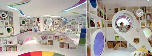
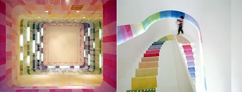
fantastical bookstore
whoa.... totally floored by this awesome kid's bookstore in beijing. wish i could find bigger pictures.
Saturday, July 7, 2007


manhattan
Things about the urban planning, aesthetics, and architecture of new york city:
"Beauty in the European sense has a premeditated quality. There was always an aesthetic intention and a long-range plan. That’s what enabled Western man to spend decades building a Gothic cathedral or a Renaissance piazza. The beauty of New York rests on a completely different base. It’s unintentional. It arose independent of human design, like a stalagmitic cavern. Forms which are in themselves quite ugly turn up fortuitously, without design, in such incredible surroundings that they sparkle with a sudden wondrous poetry."—Franz, from The Unbearable Lightness of Being by Milan Kundera
"As it happens, then, Manhattan's mathematically rational street grid is actually rotated 29º off the north-south axis – and this angle has interesting astronomical side-effects. In other words, because of the off-center orientation of Manhattan's street grid, you can only see the setting sun "down the middle of any crosstown street" on two specific days of the year: May 28 and July 13. Manhattan is a solar instrument that only works twice."-- Geoff Manaugh of BLDG blog
"Half past six: more gusts. A furious flurry of wind between the skyscrapers slides away and buffets across the park. Only a car-horn interrupts, like a slap in the face. The wind drops. A peal of bells in the stillness. And always, the siren. A tone higher now. It wasn’t bells. It is my Italian ear that hears it that way. The sheets of metal. A short clatter, like gunfire. A train passes, perhaps the elevated. A peal, prolonged, and then the siren, abrupt. Gone. The sounds change in a moment, they arise and die again immediately. The hum reasserts itself, advancing like a camouflaged army, approaches, closes in, on the alert, ready to take over completely."--Walter Murch, from "Manhattan Symphony"


Subscribe to:
Posts (Atom)